Stack up against Wise

Compare Your Deck

Wise's 2012 Pitch Deck

Fintech
Stage: Seed
Raised: $1.3M
Year: 2012
Slides: 9
Outcome: IPO at $11B valuation

Pitch Deck

1 / 9
Slide 1
Click to expand

Deck Analysis

This seed deck from Wise (then TransferWise) is an early-stage fintech pitch that crisply frames a large, addressable problem in cross-border payments and presents a simple, defensible peer-to-peer solution. It combines clear before/after economics, an easy-to-understand product flow, early traction metrics, a focused roadmap and fundraising ask — all delivered with modest design and concrete numbers. The deck is notable because it shows how a complex financial service can be reduced to a believable, low-friction operational model and early-growth story that attracted seed capital and eventually scaled to an IPO.

The Opening: Clear brand & mission

The Opening: Clear brand & mission

Slide 1 functions as a minimal but effective opener: the TransferWise name, a one-line descriptor "Peer-to-peer currency exchange," the founders' names and a date/place. It immediately tells the audience who the founders are, what the product category is, and positions the company as a marketplace/peer platform rather than a bank. The simplicity reduces cognitive load and primes investors for a focused, problem-solution narrative.

The slide’s strength is its discipline: no vision fluff, no buzzword salad. Founders can learn to start with an explicit, short pitch line and the identities behind the company. That builds credibility quickly and allows following slides to dive straight into the market problem and mechanics.
Key Takeaway: Lead with a single, explicit value proposition and founder credibility up front so the audience knows what to expect and whom they’re backing.
Problem & solution framing: Before vs After (economics-focused)

Problem & solution framing: Before vs After (economics-focused)

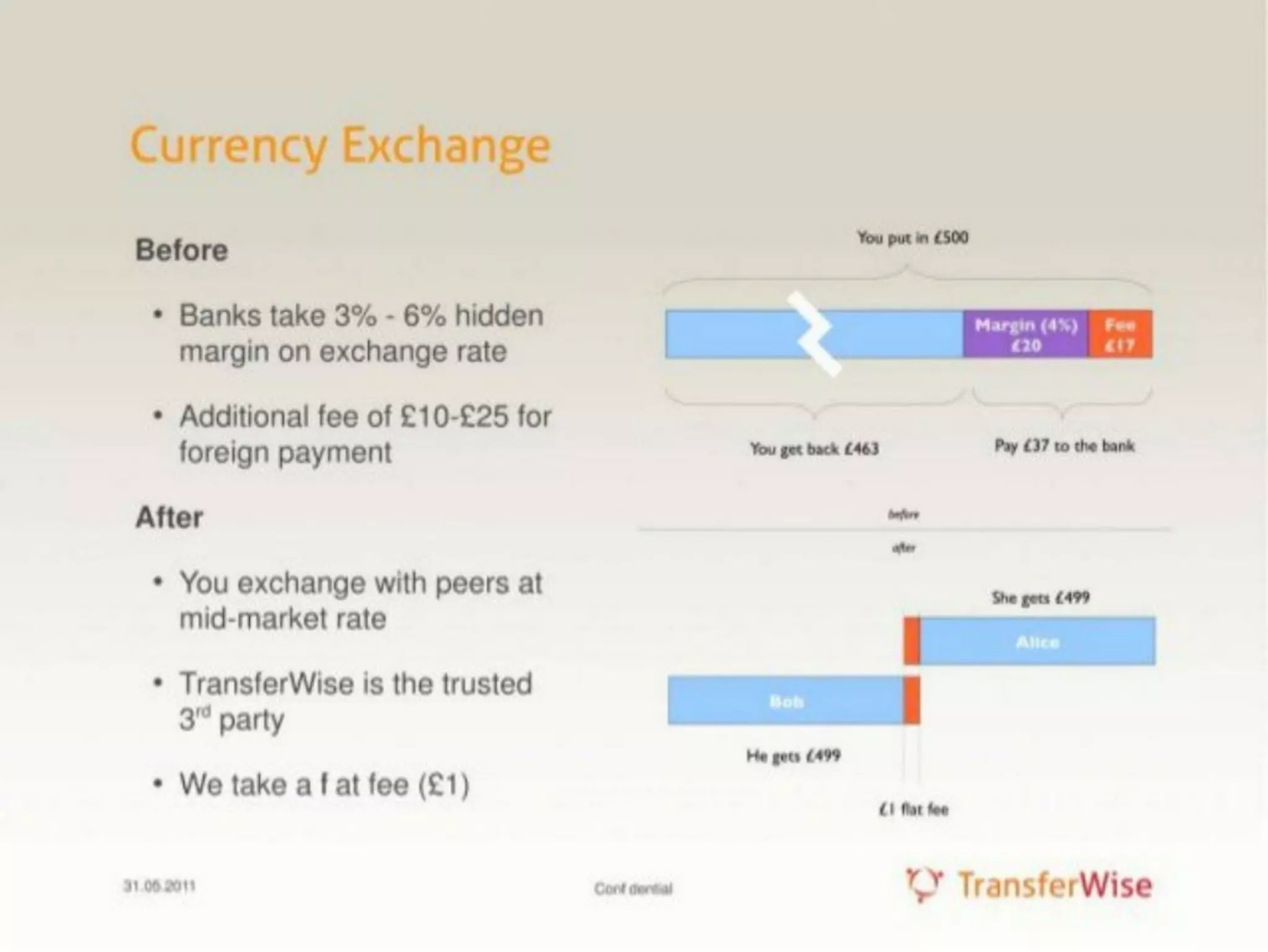
Slide 2 visualizes the problem (banks’ hidden FX margins and flat fees) and contrasts it with TransferWise’s peer-to-peer mid-market rate plus a small flat fee. The use of a concrete money example (£500) makes the abstract issue tangible and emotionally relevant: the viewer can immediately see the delta in money kept versus money lost to traditional providers. This slide anchors the rest of the deck with a clear economic incentive for users to switch.

The slide also subtly communicates defensibility: the product isn’t just "cheaper" — it’s a fundamentally different mechanics (matching peers at the mid-market rate) which is harder for incumbents to replicate quickly. Founders should emulate the technique of using a simple numeric example to make cost savings visceral and to highlight how the business model generates a unit-economics advantage.

Key Takeaway: Use a concrete numeric example to make the customer benefit and business model instantly believable and memorable.
Product and operations: How it works

Product and operations: How it works

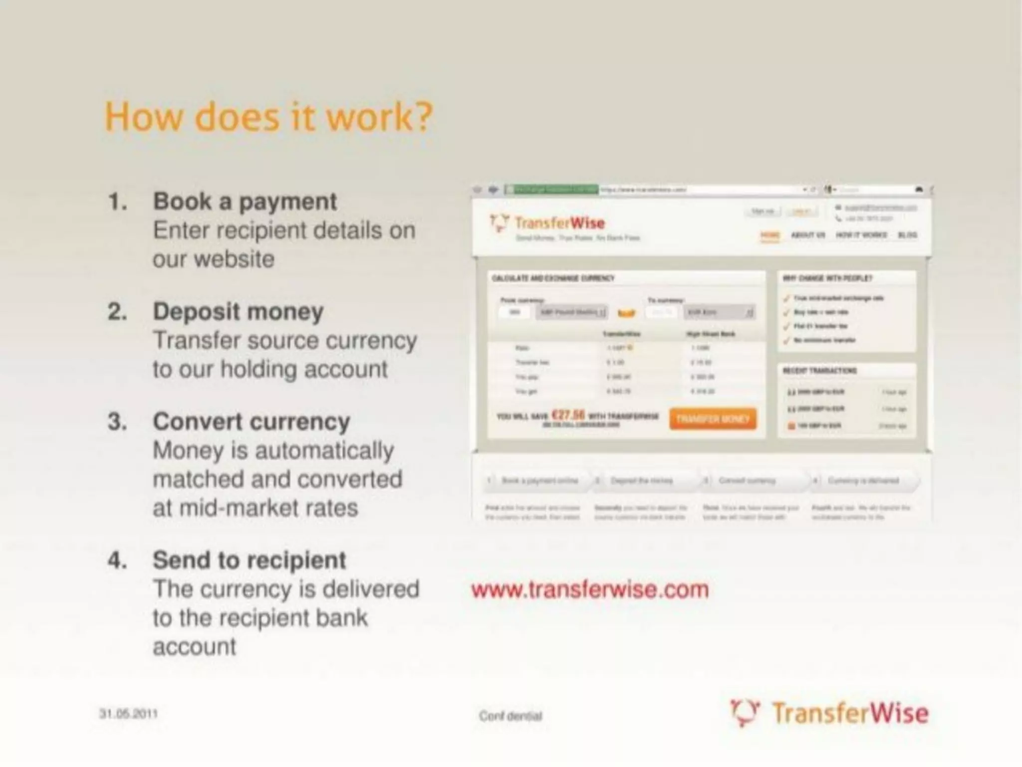
Slide 3 breaks the product into four clear steps: book a payment, deposit money, convert currency (auto-matching), and send to recipient. The stepwise flow demystifies the operational path and reassures investors that the process is straightforward and scalable. The inclusion of the web UI screenshot supports the claim that this is a real, working product and not just a concept.

This operational clarity is essential for fintech where trust and compliance are central; the slide communicates the flow of funds and touches the critical detail that conversion happens at mid-market rates via matching. Founders should emulate this approach by describing not only customer benefit but the end-to-end mechanics, showing they’ve thought through user experience, operational controls and trust signals.

Key Takeaway: Map your customer journey in 3–5 steps and pair it with an interface or operational detail to show the idea is practical and executable.
Traction: Early metrics and credibility

Traction: Early metrics and credibility

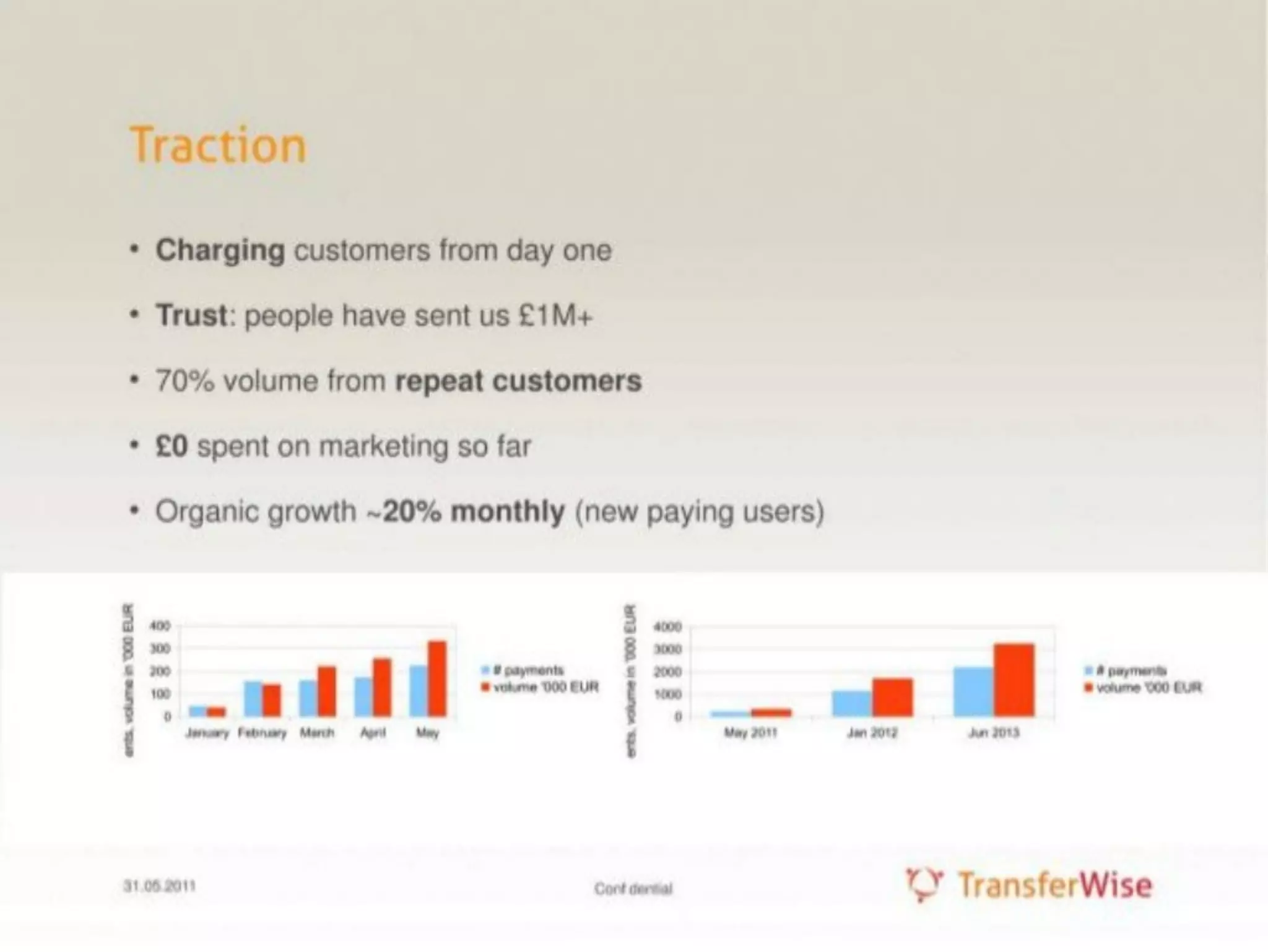
Slide 4 focuses on proof: charging customers from day one, over £1M transacted, 70% volumes from repeat customers, and ~20% monthly organic growth. These quantified signals (revenue, retention, growth rate) are exactly what investors want at seed — proof that the offering meets a real need and that unit economics and virality exist. The note that £0 was spent on marketing further highlights product-led growth.

Visual mini-charts at the bottom show month-over-month increases, reinforcing the narrative. The slide demonstrates how early traction can compensate for limited resources: strong user behavior metrics and retention are more persuasive than polished marketing. Founders should always lead with credible, simple metrics (revenue, repeat rate, growth %) and explain customer acquisition dynamics.

Key Takeaway: Show real, simple metrics that prove product-market fit — revenue, repeat usage, and organic growth beat shiny projections without traction.
Team: Complementary backgrounds and credibility

Team: Complementary backgrounds and credibility

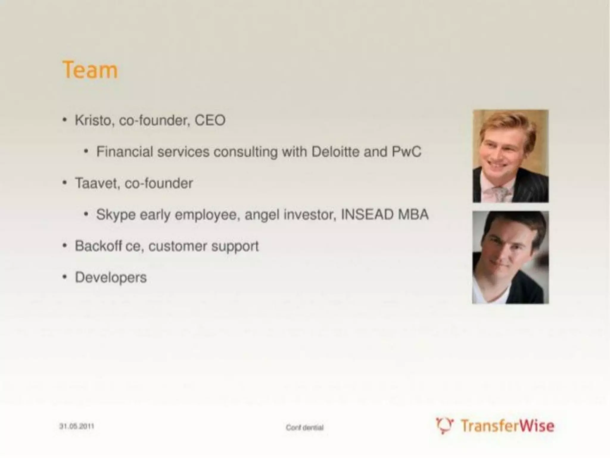
Slide 7 presents the founding team with short bios: a CEO with financial services consulting experience and a co-founder with early Skype experience and an MBA. Photographs add a human touch and the bullet points highlight relevancy to the problem (financial services knowledge, product/tech credibility). The slide also lists early hires (customer support, developers), indicating they’ve allocated resources to growth and operations.

This slide’s effectiveness is its economy — it doesn’t overstate credentials but picks the most relevant past experiences that map to the company’s needs. For founders, the lesson is to present team bios that are explicitly tied to the company’s risk profile (e.g., compliance and payments require finance background; marketplace scaling requires product/tech experience).

Key Takeaway: Match team bios to the startup’s biggest risks; show why this particular team is the right one to execute the plan.
Financing & roadmap: Ask, milestones, and expansion plans

Financing & roadmap: Ask, milestones, and expansion plans

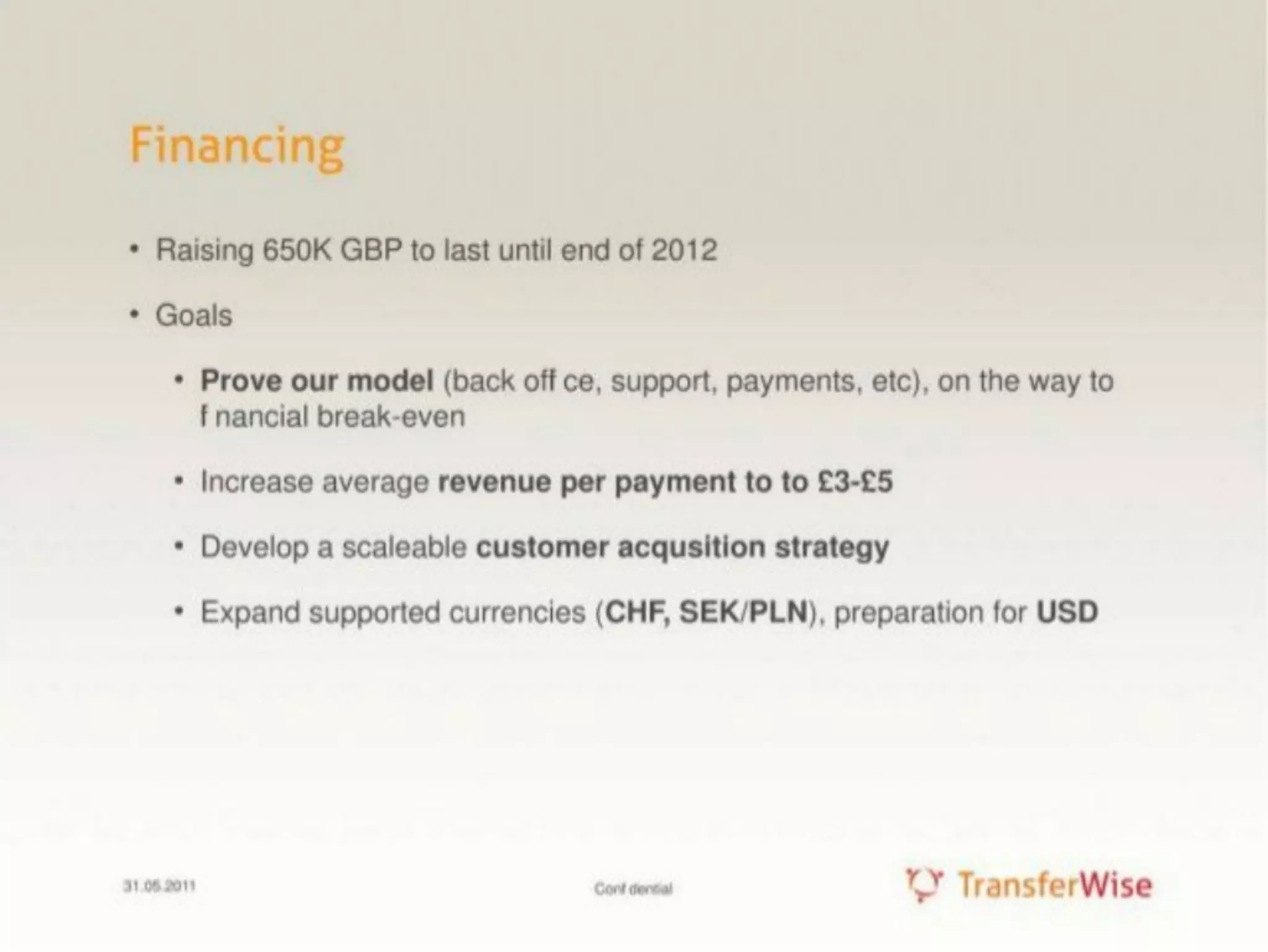
Slide 8 lays out the fundraising target (raising £650K to last until end of 2012) and concrete goals: prove the model, increase revenue per payment, develop scalable customer acquisition, and expand supported currencies (preparing for USD). This slide connects the capital ask to specific milestones and growth levers, which is critical for investors assessing risk and use-of-funds. The explicit revenue-per-payment target shows they’re thinking about monetization levers rather than purely growth metrics.

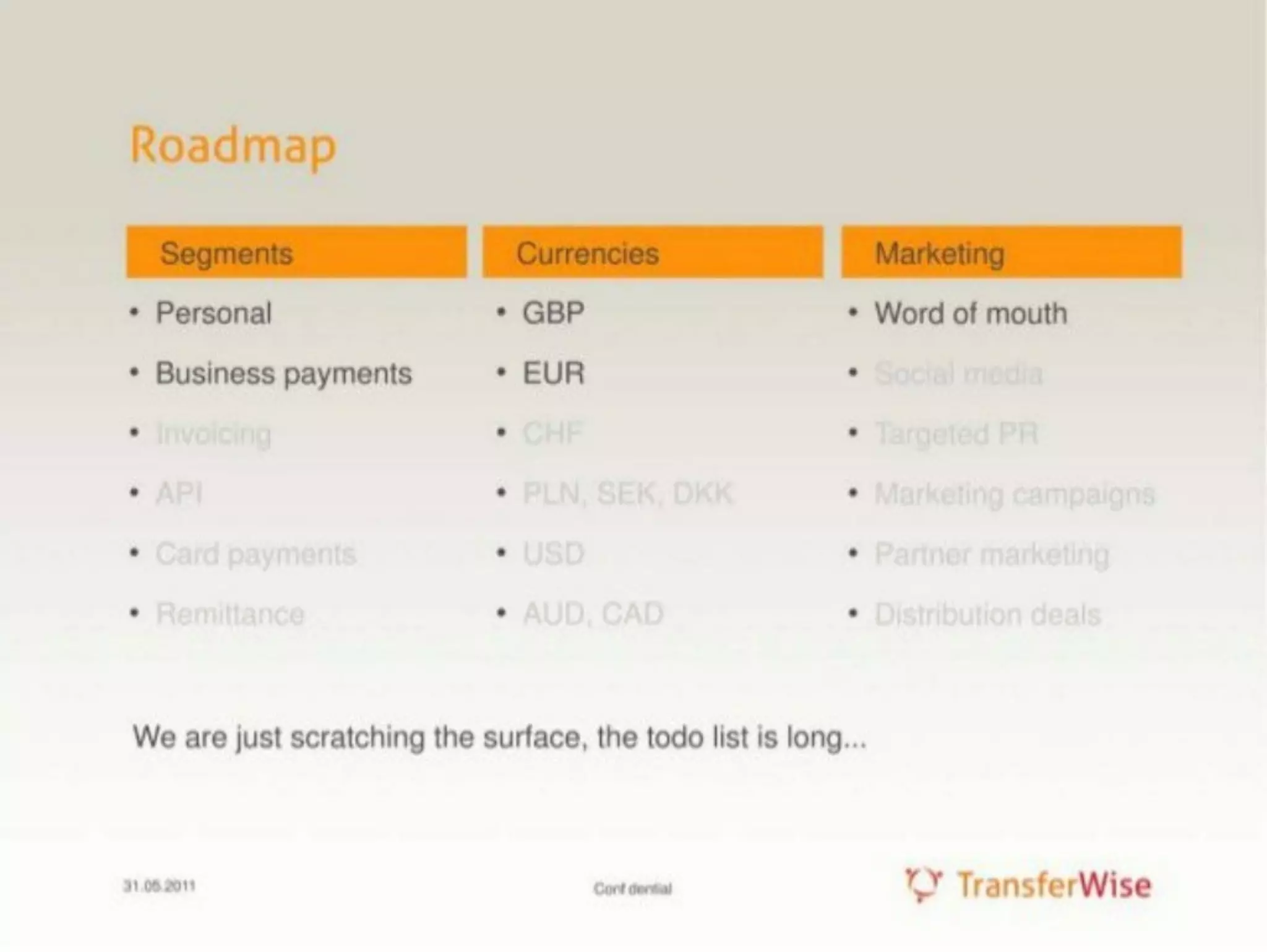
The roadmap-like clarity — product, market expansion, and customer acquisition — demonstrates a pragmatic plan to reach break-even. Founders should emulate this by tying the funding ask to measurable milestones and by specifying which levers (pricing, channels, product features) will be used to improve unit economics.

Key Takeaway: Tie your funding ask to time-bound milestones and the specific levers you’ll pull to improve unit economics and scale.

Conclusion: Key Lessons

This deck is a strong example of disciplined storytelling: identify a clear customer pain, quantify the economics with a concrete example, explain the product flow, prove traction with simple metrics, show the right team, and tie the fundraising ask to measurable milestones. Its strength lies in simplicity and credibility — no unnecessary slides, just evidence and execution plans.

Actionable advice for founders: use one tangible example to make the problem real, present the end-to-end user and fund flow so investors trust your operations, lead with hard traction metrics that demonstrate retention and organic growth, and connect your capital raise to specific, achievable milestones and revenue levers. Keep slides concise, data-driven, and explicitly mapped to investor concerns (market size, defensibility, traction, team, use of funds).