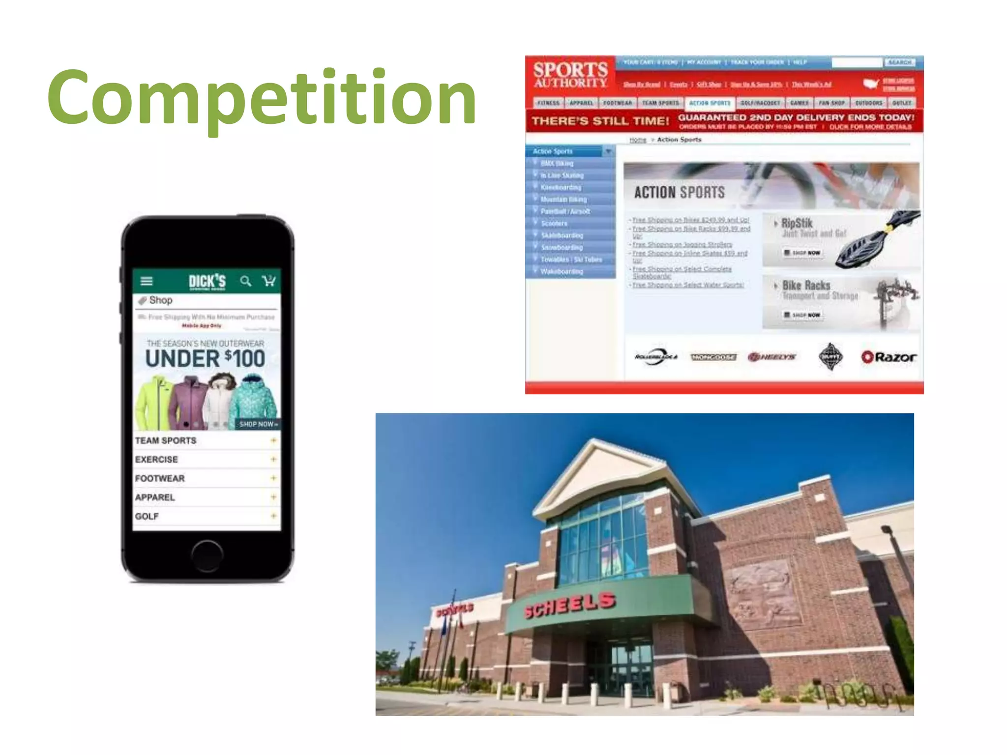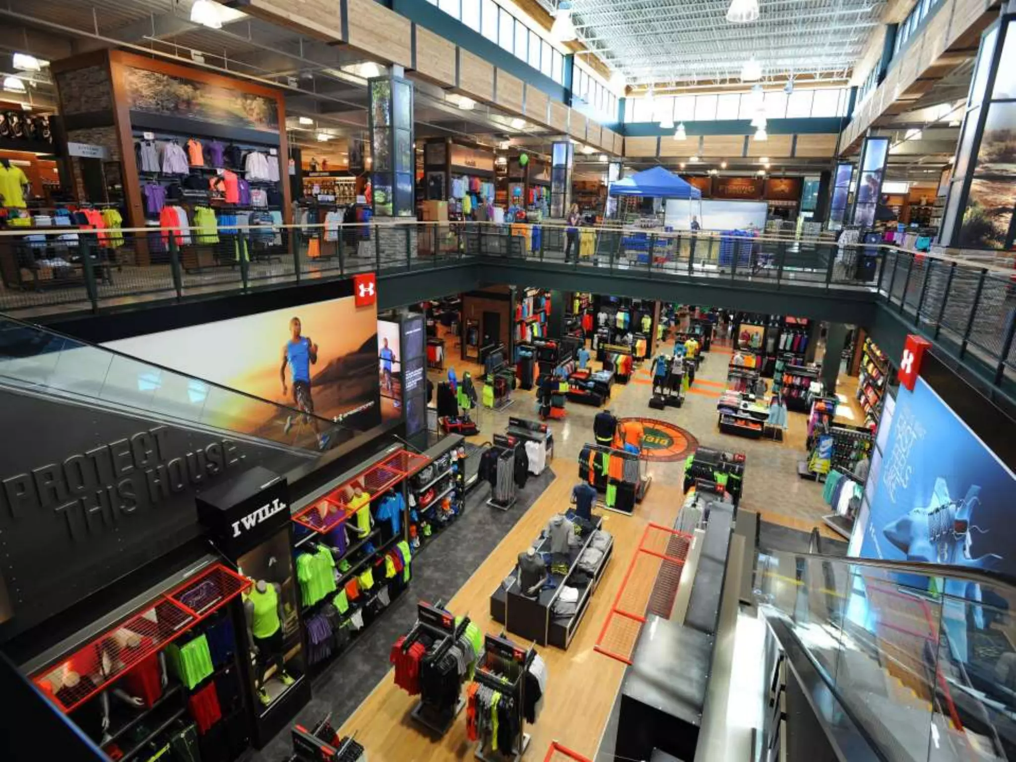
Establishing the Problem: Retail Overload and Physical Context
Slide 1 (store interior) visually anchors the deck in a real-world problem: large, multi-brand sporting goods stores are crowded with inventory and options. Using a single panoramic photo of a big-box sporting retail environment communicates at a glance the friction Zoom intends to address — discovery and decision-making in physical retail. This is an effective opening because it requires no text to communicate the pain point; viewers instantly understand the customer's context.
Founders can learn how powerful context-setting images can be. Rather than launching immediately into numbers or product screenshots, the deck shows where the customer is and what they experience. This approach builds empathy and makes subsequent product slides feel like a natural solution rather than a disconnected demo.