Stack up against Front

Compare Your Deck

Front's 2022 Pitch Deck

SaaS
Stage: Series D
Raised: $65M
Year: 2022
Slides: 11
Outcome: Valued at $1.7B

Pitch Deck

1 / 11
Slide 1
Click to expand

Deck Analysis

This Series D pitch deck from Front (2022) presents a concise, design-forward fundraising narrative for a customer communication hub. It balances product explanation, customer validation, market sizing, and operational traction while using strong visuals and a consistent brand aesthetic. Notable elements include clear metrics up front, recognizable logos for credibility, and a simple progression from problem to product to market opportunity — making it easy for investors to follow the thesis and assess scale and defensibility.

The Opening: Brand and Tone

The Opening: Brand and Tone

The title slide (clean, large typography, soft gradient background) sets a calm, modern tone and positions Front as a premium product. It uses minimal text — just the company name and date — which signals confidence: the team trusts the following slides and the brand to carry meaning. The visual consistency here (logo placement, color palette) primes investors for a professionally designed presentation and prepares them for a product-driven story.

Founders can learn the importance of first impressions: a simple, well-executed cover slide conveys polish and attention to detail, which is especially important for B2B SaaS where design and UX often correlate with customer experience. It also gives the presenter flexibility to jump into the narrative without overloading the opener with numbers or claims.
Key Takeaway: Use a minimalist, on-brand cover to establish credibility and let the rest of the deck carry the narrative.
Key Metrics Upfront: Building Credibility Quickly

Key Metrics Upfront: Building Credibility Quickly

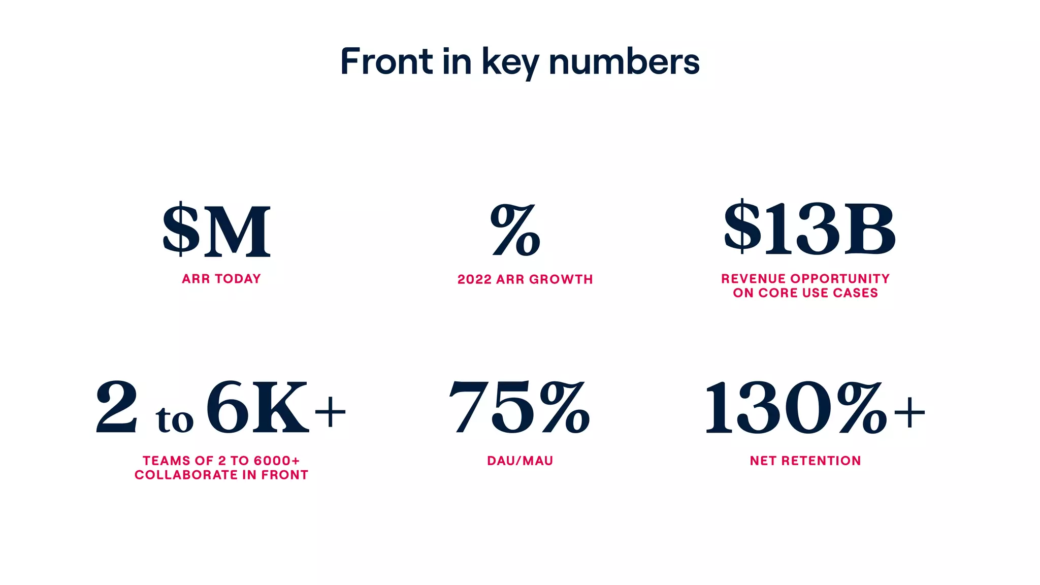
Slide 2 puts core metrics front-and-center (ARR, growth, revenue opportunity, team sizes, DAU/MAU, net retention). Even without exact numeric ARR and growth values visible here, the layout communicates what metrics matter and that Front is tracking them. Showing net retention >130% and DAU/MAU at 75% is a strong signal of product-market fit and engagement — two of the most important indicators for SaaS investors.

This arrangement teaches founders to lead with the KPI story early. Investors read for traction; placing stickiness, retention, and TAM-oriented metrics early helps establish that the company is beyond mere concept and growing predictably. The slide also balances ambition (TAM) with operational rigor (retention and engagement), which reduces investor risk perception.

Key Takeaway: Lead with a compact KPI slide that highlights retention, engagement, TAM and growth to establish traction quickly.
Customer Logos: Social Proof and Segmentation

Customer Logos: Social Proof and Segmentation

Slide 3 showcases customer logos and states the customer count (8,000 customers) — a classic social proof play. The mix includes well-known tech brands (Dropbox, Shopify, ClickUp) plus enterprise names (Cisco), which signals that Front spans both high-growth startups and large organizations. This breadth helps argue that the product is both flexible and enterprise-capable.

For founders, the lesson is twofold: first, quality logos accelerate credibility far more than additional text, and second, explicitly calling out customer count alongside logos provides context on adoption depth. If you’ve secured marquee customers across segments, showcase that diversity to demonstrate both product-market fit and the ability to scale into larger accounts.

Key Takeaway: Use recognized customer logos plus a clear customer count to provide instant social proof and highlight cross-segment traction.
What the Product Is: Clear, Visual Product Story

What the Product Is: Clear, Visual Product Story

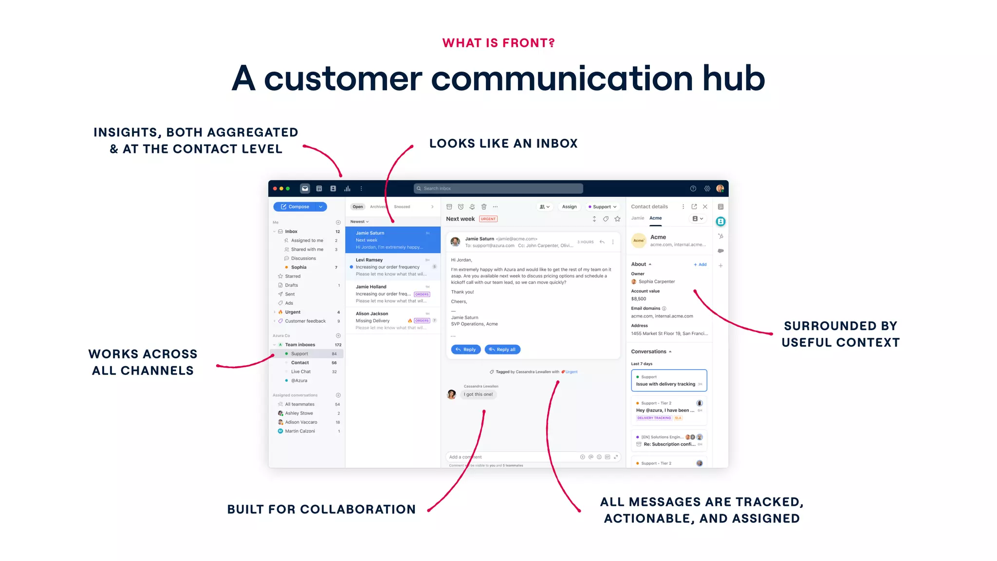
Slide 4 answers the core question — what is Front? — using a large product screenshot annotated with short value statements: looks like an inbox, works across channels, built for collaboration, surrounded by useful context, and messages are tracked and actionable. The visual + callout approach is highly effective because it shows rather than tells: investors immediately see the UI and mental model (an inbox for teams) and the specific capabilities that differentiate it from a standard email client.

Founders should emulate this: combine a real product screenshot with a few crisp callouts that map product features to customer benefits. This reduces abstraction, helps non-technical investors understand the experience, and anchors future slides about use cases and monetization in a tangible UI.

Key Takeaway: Show the product in-context with concise callouts to make the value tangible and reduce conceptual friction.
Market Positioning: Mapping the Opportunity

Market Positioning: Mapping the Opportunity

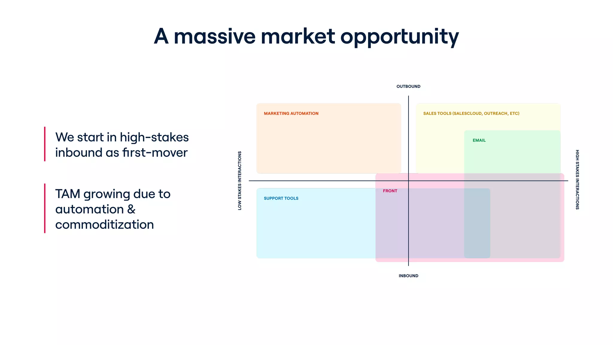
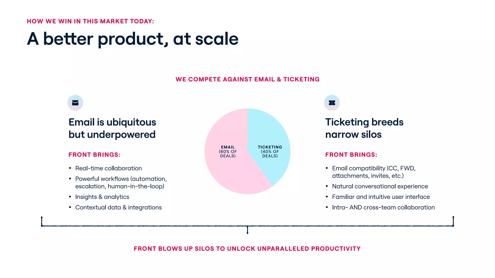
Slide 5 uses a quadrant/overlap diagram to place Front relative to marketing automation, sales tools, support tools, and email. The graphic emphasizes Front's position as focused on inbound, high-stakes interactions and captures how adjacent markets are shifting (automation commoditizing TAM). The left-side bullets explain the go-to-market approach (start in high-stakes inbound) and why TAM is expanding, which ties product positioning to a pragmatic growth plan.

This slide is effective because it visually communicates strategy and competitive differentiation simultaneously. Founders should use simple visual maps to explain where they play, how adjacent categories behave, and why their initial beachhead is defensible. It’s a clear way to show both immediate market and future expansion vectors without long text explanations.

Key Takeaway: Use a simple competitive map to show your beachhead and how adjacent markets create expansion opportunities.
Use Cases & Customer Outcomes: Specifics that Sell

Use Cases & Customer Outcomes: Specifics that Sell

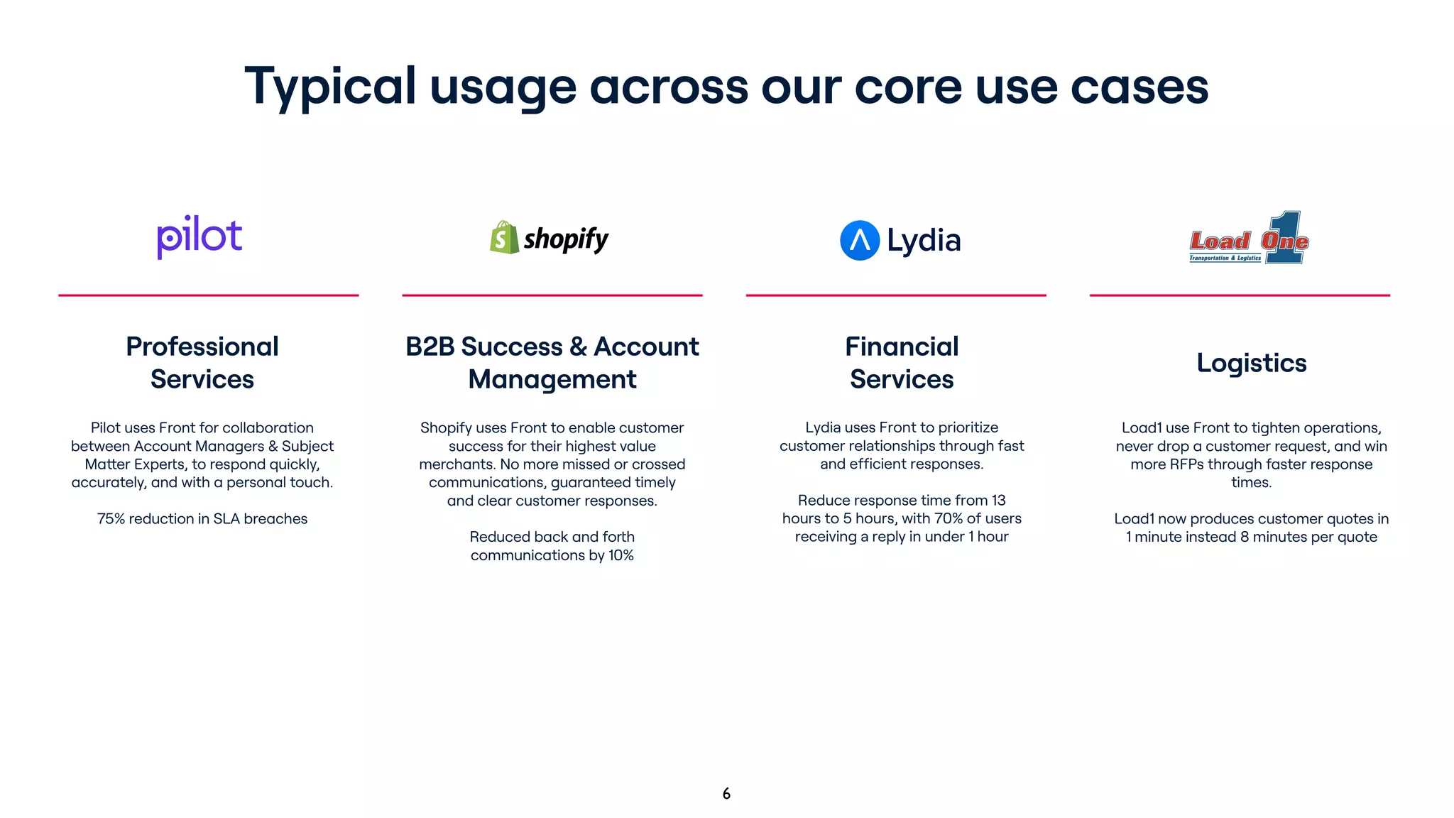
Slide 6 lays out typical usage across core use cases (professional services, B2B success/account management, financial services, logistics) with short outcome-focused descriptions and percentages (e.g., SLA reduction, response-time improvements). This makes the product’s ROI explicit for different buyer personas and industries, and demonstrates that Front tailors to measurable pain points rather than being a one-size-fits-all messaging app.

The practical takeaway for founders is to always translate features into concrete customer outcomes: time saved, SLA improvements, percent reductions, or process efficiencies. Specific, quantified results make case studies persuasive for both sales and investors, and help later justify pricing and expansion strategies.

Key Takeaway: Frame product features through industry-specific use cases and measurable outcomes to make ROI obvious.
Traction and Unit Metrics: Showing Product Stickiness

Traction and Unit Metrics: Showing Product Stickiness

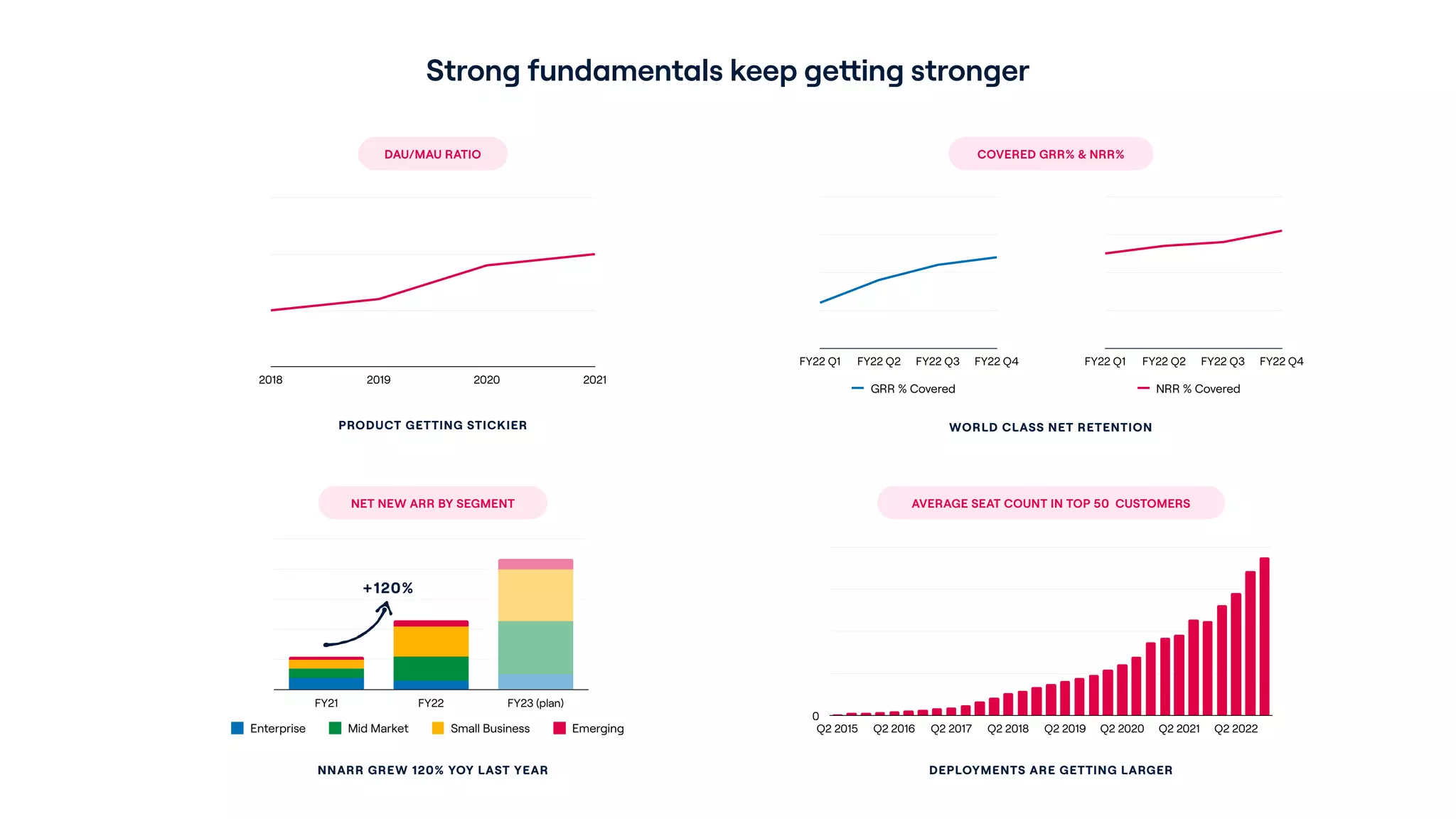
Slide 8 consolidates durability metrics — DAU/MAU trend, GRR/NRR coverage, net new ARR by segment, and average seat count growth — into one slide demonstrating strong fundamentals. The mixed use of line charts and stacked bars shows both user engagement improvements and revenue expansion across segments, highlighting that deployments are getting larger and retention remains high. These are the kinds of metrics that indicate a scalable SaaS business with land-and-expand dynamics.

For founders, this emphasizes the need to present both engagement (stickiness) and revenue expansion (NRR, seat growth) together. Investors look for the compound effect: high engagement leads to expansion, which improves unit economics. Showing these trends visually (quarter-over-quarter and year-over-year) makes the growth pattern credible and easier to digest.

Key Takeaway: Combine engagement and revenue expansion metrics to prove stickiness and scalable land-and-expand economics.
Vision: A Long-Term Platform Narrative

Vision: A Long-Term Platform Narrative

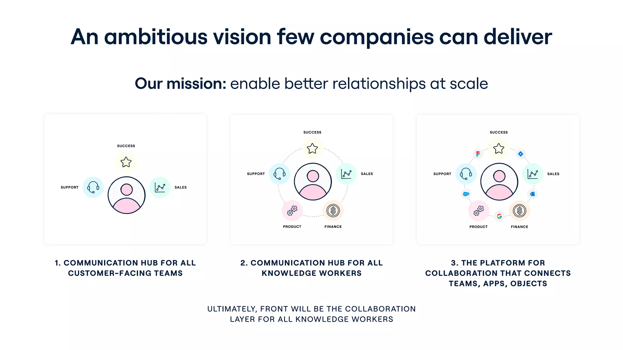
Slide 9 articulates a three-step vision: be the communication hub for customer-facing teams, expand to all knowledge workers, and become the collaboration platform connecting teams, apps, and objects. The visuals show progressive concentric circles of integration — a simple but powerful way to convey long-term ambition without losing the immediate product focus. This signals to investors that the team has a defensible roadmap for moving up-market and broadening use cases.

This slide is useful for founders because it demonstrates how to balance near-term commercial priorities with a credible long-term platform narrative. Lay out a plausible path from niche to platform and illustrate the stages; investors want to see both a bite-sized beachhead and a vision for durable expansion that leverages integrations and network effects.

Key Takeaway: Present a staged product roadmap that links a defensible beachhead to an aspirational platform vision.

Conclusion: Key Lessons

This deck succeeds by combining visual clarity, early emphasis on metrics, and a clear path from product to market to platform. Strengths include: a polished, consistent design language; KPI-first sequencing (retention, engagement, TAM); strong social proof via recognizable customers; a concrete product walkthrough; and a staged vision for expansion. Each of these elements reduces investor friction by answering the most common questions (what is it, who uses it, how sticky is it, and what’s the upside).

Actionable advice for founders: lead with your strongest traction metrics, show the product in context with concise callouts, use customer logos and specific use cases to signal credibility, and map a realistic beachhead that connects to a larger platform opportunity. Keep slides visually simple, quantify outcomes where possible, and structure the narrative so each slide answers a single investor question — proximity to product-market fit, ability to scale, and defensibility.