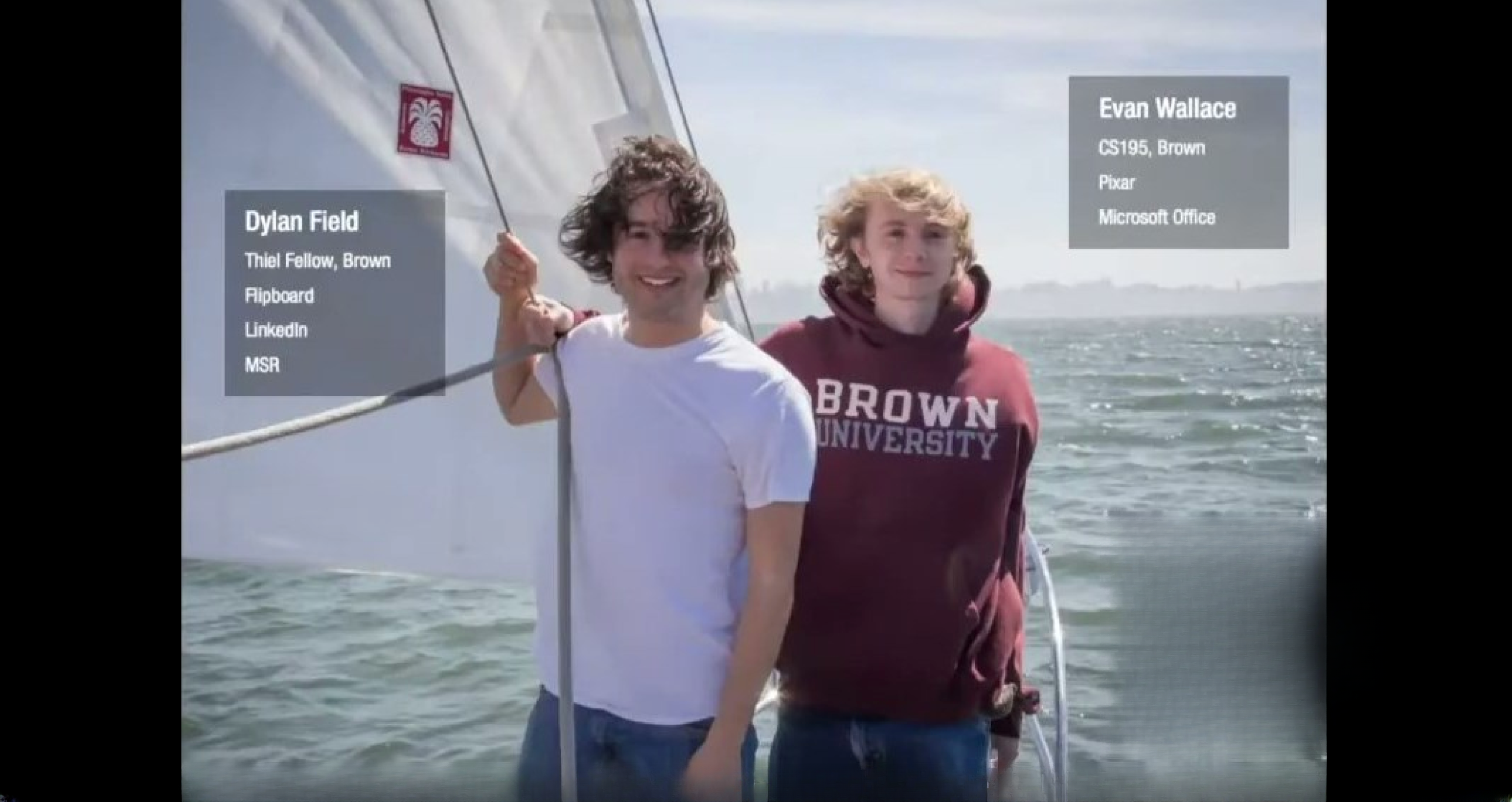
Team & Founders — establishing credibility up front
Slide 1 opens with a photographic, human introduction of the founders and short badges of pedigree (schools, companies). The visual is informal but communicates who the founders are and where they came from — a concise trust signal without a verbose bio. For pre-seed decks this approach works well: it gives investors quick context on technical and network credibility while keeping attention on the product story that follows.
The slide balances personalities and succinct credentials rather than long resumes. Founders should learn to surface a few high-impact signals (relevant past employers, technical fellowships, or startup exits) that align with the product’s risk (technical risk, distribution risk, etc.) and to do so in a single glanceable frame that sets the stage.