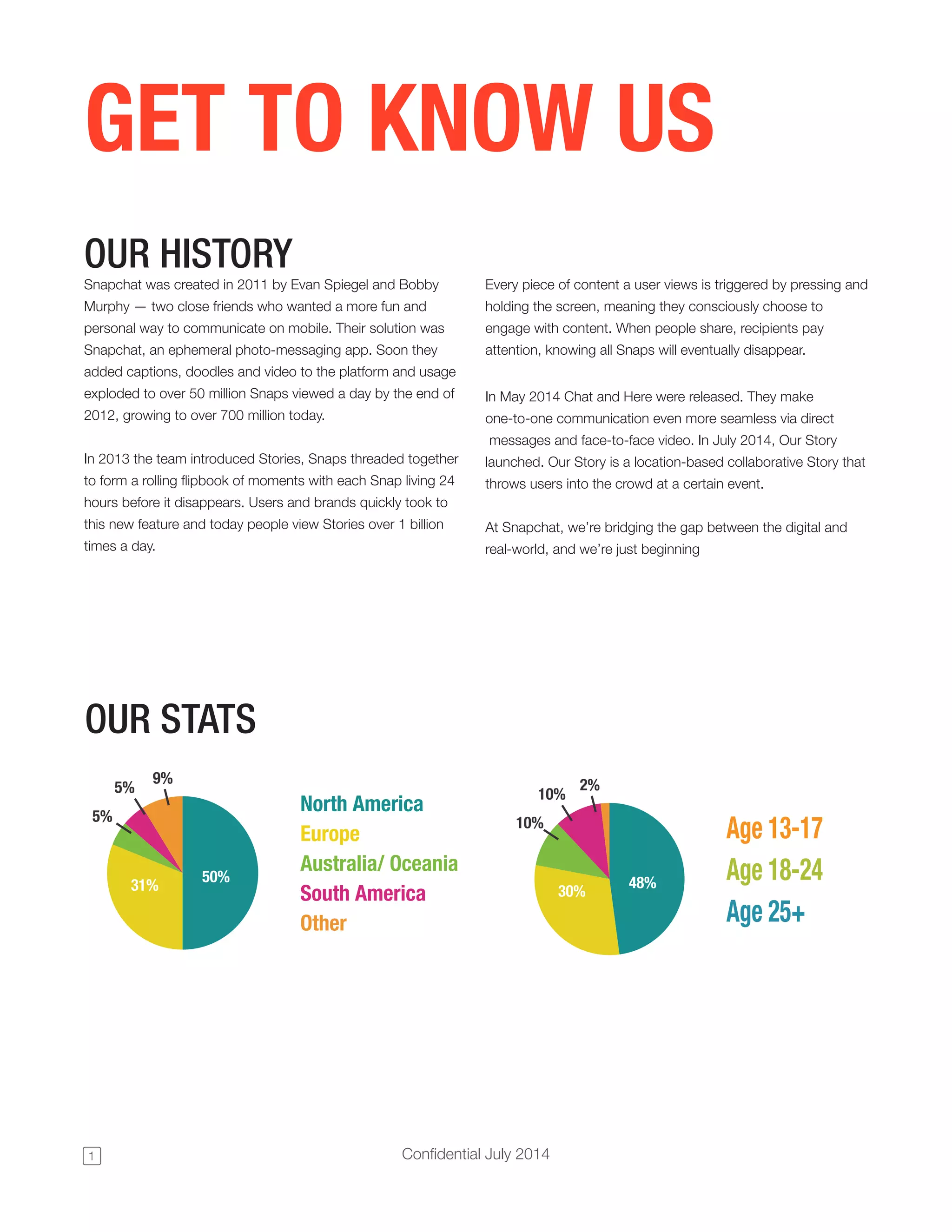
Cover & Brand: Instant recognition and tone-setting
The cover (slide 1) uses Snapchat’s iconic yellow and ghost logo with a bold “FOR BUSINESS” headline. It’s not trying to overwhelm with numbers or features — it immediately communicates brand identity and signals that the deck is targeted at commercial partners rather than consumers. The minimalism is powerful: the color and symbol do the heavy lifting, creating instant recognition and emotional association before any words are read.
For founders, this is a reminder that the first impression should set tone and audience expectations. If your product has strong visual equity, lead with it; it communicates confidence and focuses the reader on what matters next in the deck.
Key Takeaway: Start with a memorable, audience-specific cover that leverages brand assets to set tone and focus before diving into features or metrics.