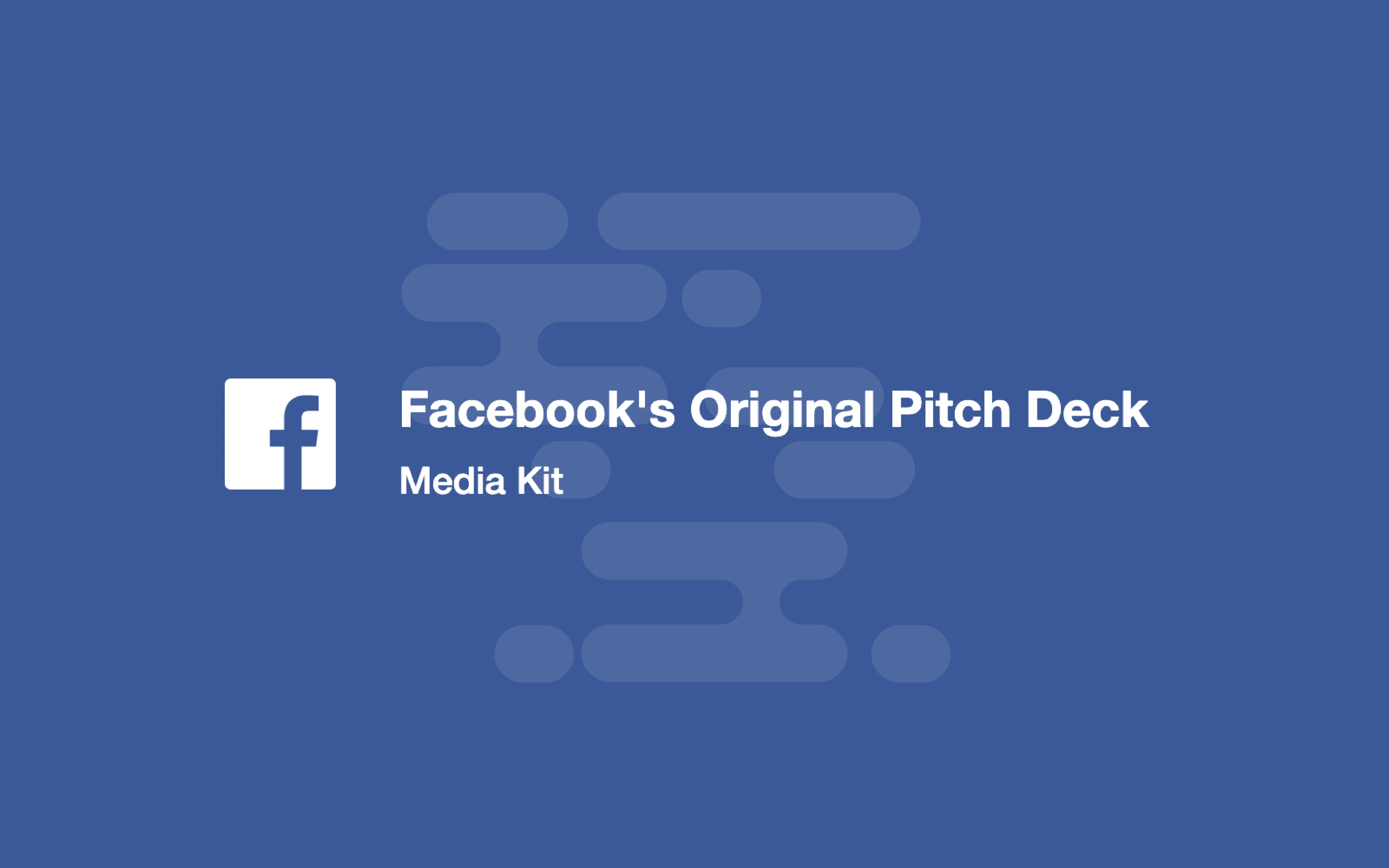
The Opening: Strong, focused branding and frame
The title slide (SLIDE 1) uses a single, bold brand treatment and a compact subtitle (“Media Kit”), immediately signaling professionalism and clarity. The simple blue background with the recognizable mark centers attention and sets a consistent visual tone for the rest of the deck. By treating the pitch as a 'media kit' rather than an investor-only document, the founders position the product as public-facing and press-ready, which amplifies credibility.
Founders can learn from this economy of design — open with a recognizable identity and a one-line descriptor that frames how the audience should read the rest of the slides. The visual consistency also helps; a tight color palette and a single type hierarchy reduce cognitive load and let the content speak for itself. This approach builds immediate trust and reduces friction when the deck transitions into product details and metrics.