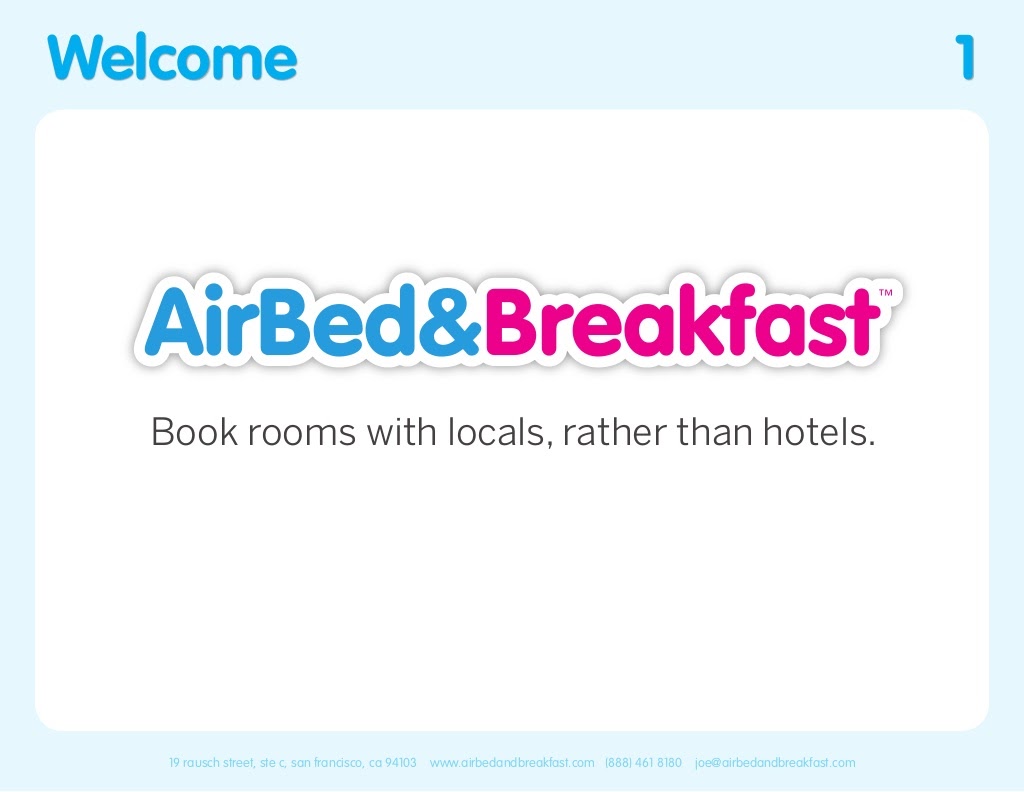
The Opening: Simple, human cover that sets the brand tone
The opening slide (cover) pairs a warm, lived-in interior photo with a bold brand lockup and the one-line value proposition “Book rooms with locals rather than hotels.” The visual immediately signals that this is a hospitality product rooted in local experiences rather than commodity lodging. The aesthetic choice (homey photography, generous white space and a friendly red accent) establishes an emotional connection and orients the audience to the problem space before any numbers are shown.
For founders, this demonstrates the power of a single, memorable positioning line backed by evocative imagery. You don’t need to cram the cover with metrics or a long description — use it to convey tone, audience, and the core promise in a way that primes the rest of the presentation.